Colours have a huge impact on our moods, our thoughts and our emotions.
This is true in the design world, too. When working on the design of something, colour plays a huge part in the impact it has on the audience.
This could include the design of presentations, brochures, digital adverts and just about everything else!
Let’s look into the specific types of colours and the psychologies behind them…
Warm and cold
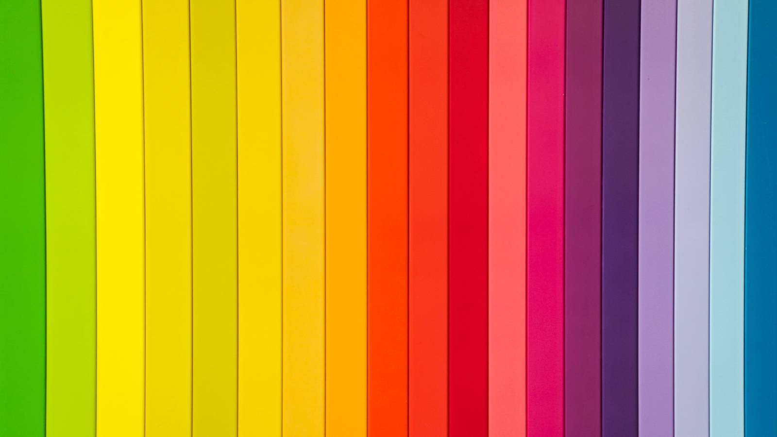
Warmer colours, such as pink, red, orange and yellow, stimulate. These colours are great for conveying or emphasising key messages.
Cold colours, such as purple, blue and green, relax. These are good for emphasising your secondary points, or for use on borders and background.
Equally, you can use warm and cold shades of the same colour to the same effect – a warming red for the key points, with a cool, harsher red for the secondary points.
Complementary
Complementary colours are direct opposites of each other on the colour wheel.
For example:
- Red + green
- Purple + yellow
- Blue + orange
These combinations create contrast and emphasis when used together and in turn, have the power to impact certain points in a presentation.
Harmonious
This concerns triads of colours that appear next to each other on the colour wheel.
For example:
- Purple + blue + green
- Blue + green + yellow
- Red + orange + yellow
- Purple + red + orange
In contrast to complementary colours, harmonious triads create a relaxing effect when used together, making them a good option for general use and backgrounds.
Now we’ve established the different types of colours and their psychologies, let’s discuss how to use them…
Keep colours refined
Using three main colours in a presentation is a good rule to follow.
Too few and your presentation will lack engagement and hierarchy. Use too many and your presentation will become unclear, complicated and damage the attention of your audience.
Focus and theme colours
A particular focus colour can be chosen throughout your presentation. Equally, a colour scheme or brand colours can be used to create connectivity, emphasis and coherence.
Colours can be used effectively to create awareness and repetition to help viewers remember your key messages. For example, you could only use red when referring to ‘X’ and only use green when referring to ‘Y’.
The psychology behind specific colours…
Red
Red has been scientifically proven to stimulate a faster heart rate. It demands attention. Hence why it is used in road signs, important notices and to alert when there is danger. Red has the longest wavelength of all colours, meaning red appears closer to the eye than where it really is, making it a useful colour to use for highlighting key points.
Orange
Red and orange stimulate the autonomic nervous system. As mentioned earlier, these warming colours create stimulation and are great for conveying key points.
Green
Green requires no adjustment when it hits the retina, making it the easiest on the eye – this is the reason why green rooms work so well. Green colours also help viewers to retain information.
Blue
Blue is a conventional colour to use in branding. It is associated with security and reliability to show that blue does not take any risks. Many companies use blue as their brand colours to convey their sense of trust and reliability in services.
Black
Black is the total absorption of all colours. Black conveys substance.
White
White is the absence of colour, creating space when used in design and presentations.
Purple
Purple increases brain activity for increased problem-solving. Purple also has the shortest wavelength, making the colour seem further from the eye than it is. This is the reason why purple elements of a presentation make for a relaxed viewing. Purple is great to use for secondary points or as a background.
When you put together your next presentation, it’s important you remember this guide to ensure you make the most use of colour for your audience.
If you’ve got brand colours already, but you’re not sure how to make them work in your presentation design, we’re here to help. Get in touch.